How to Build an Infographic With AI
Build an infographic with AI (without losing your mind) often takes several steps. See our guide for how to get the best possible results by using several tools in succession.
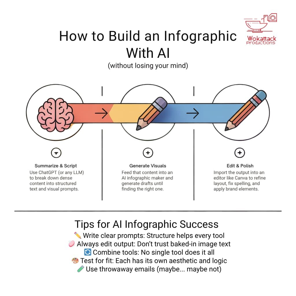
- No single AI tool can do it all — combining text generation, visual design, and editing tools yields far better infographics.
- A simple 3-step workflow — using ChatGPT, an AI visual generator, and Canva produces faster, more polished results.
- Tool strengths vary — some excel at content, others at visuals—knowing which to use (and when) saves time and frustration.
This was the first time I’d given ChatGPT a prompt and received the chirpy—yet oddly bleak—reply:
“Sure, that’s gonna take me about 48 hours.”
Why would it take ChatGPT that long? Good question—and one I’ll explore in a future article.
The prompt was simple enough: generate an infographic.
So, while ChatGPT disappeared into the digital weeds, I took the opportunity to explore the current landscape of AI-powered infographic tools.
Turns out, building a good infographic with AI isn’t a one-click affair. But with the right chain of tools—and a bit of trial and error—you can get slick, shareable results surprisingly fast.
From 16-page report to shareable visual
The project started with a familiar task: turning a recently released 16-page report into an infographic suitable for social media and other platforms. A standard challenge for most comms and marketing teams.
I asked ChatGPT to condense the report into clear messaging, imagery, and layout suggestions.
When I followed up about the unexpected 48-hour timeline, it explained that the report was structured into three distinct sections—each with its own insights and key messages.
Being the tireless optimist it is (unless you specifically ask it not to be), ChatGPT cheerfully assured me this was an excellent foundation for something special. All I needed was a bit of patience.
A dive into the AI infographic pool
If you work in media (as I used to) or communications (as I do now), you know that “taking your time” is rarely an option. Patience is a unicorn. On a skateboard. Doing tricks. While on fire.
So, I ducked beneath Google’s endless scroll of sponsored links and dug into a handful of AI infographic tools to see what they could actually do.
Each one started with the same input: a text summary of the report’s three sections, plus a design prompt—both generated with help from ChatGPT.
Training wheels (still) required
One thing became clear fast: no tool I tested could handle both visual design and content generation equally well.
Some nailed the look and feel. Others got the facts right. A few managed to structure things well—but none could pull off all three at once.
Another surprise? Each tool had its own distinct design aesthetic—and most took significant creative liberties with the prompts. Sometimes, those wild interpretations actually worked better than expected.
Why chaining tools beats one-click solutions
To create something functional and good looking, I found that combining tools was the only reliable path forward.
Here’s the workflow that worked best for me:
ChatGPT – to generate concise, structured content and visual prompts.
An AI infographic tool – to turn those prompts into a designed visual (with varying success).
Canva – to clean up the layout, fix the text, and add polish.
This approach took longer than just feeding everything into a single tool and hoping for magic—but the results were more custom, more compelling, and less, well… template-y.
And honestly? It still took a fraction of the time it would’ve taken to design from scratch.
I recorded a quick video to show how the full process plays out. You can see it below.
Everyone is a winner
In the spirit of ChatGPT’s cheerleader personality, there is a little of what I found each solution did well (and also a little about what it did not do so well).
- Ideogram: Some of the most unique and polished infographic suggestions. Strong layout structure, visually appealing, and often insightful. However, text frequently came out garbled or incomplete. You’ll likely need a third step—like uploading the image to Canva—to fix the copy and align layout.
- NoteGPT: A familiar GPT-style interface with wide-ranging tools. Summarisation and structure generation worked well for broader content. The infographic feature was not ready for prime time. It may only be useful for students when it is fully developed. Text overflowed or vanished entirely, and the visuals lacked coherence.
- Text2Infographic: Simple, command-line-style interface. Good with short, clear prompts. May appeal to users used to LLMs like ChatGPT or Gemini. Be aware that it fails hard on complex or layered input. Designs are hit-or-miss and did not feel business-ready.
- Infogram: Strong charting capabilities—especially timelines, tables, and bar/column formats. A decent AI prompt interface for basic visualisation. The AI layer feels bolted on. Outputs rely heavily on fixed templates, offering little creative flexibility.
- Piktochart: Wide variety of templates. Easy setup and a familiar drag-and-drop editor. Great for manual customisation. That said, the AI element is limited. It is better to skip it and use the templates directly with your content.
- Canva: Ideal for refining AI-generated images. You can replace baked-in image text with actual editable copy, align elements, and apply brand colours. Although it features an internal AI, I would not consider it an AI infographic generator in itself. Instead, I view Canva as an integral part of various AI, communication, and marketing workflows.
- Vengage: Similar to Canva in layout and UX. Its AI assistant helps tailor designs for different use cases. Sound template library: Needed a lot of nudging to deliver useful content. Also, one of the pricier options.